Southside Builders Visual Identity
Branding
Southside Builders Visual Identity
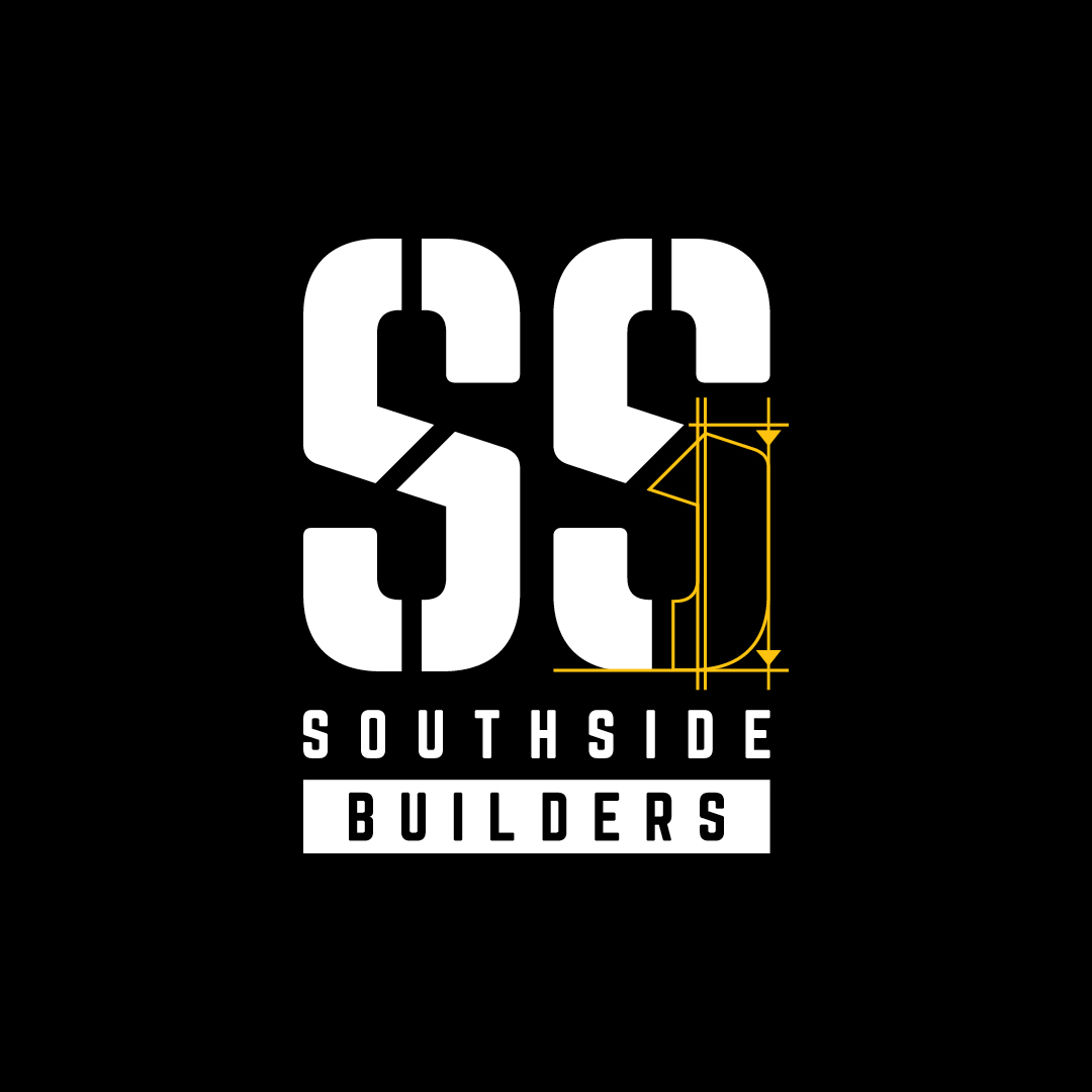
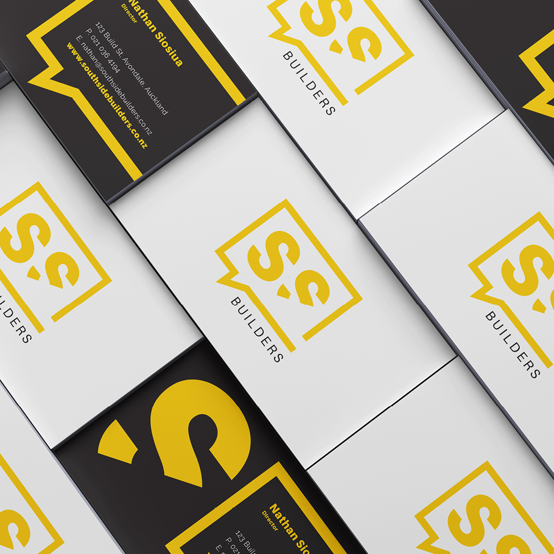
The Southside Builders logo was designed to be bold and architectural to emphasise construction. The two ‘S’s come from the syllables of Southside and are cut into sections to enhance their block form and the feeling of the letters being in the process of being built. The yellow lines and arrows both reference architectural plans and form a scaffold for the construction of the remainder of the right ‘S’. ‘Southside Builders’ sits strong and proud beneath and plays on positive and negative space.
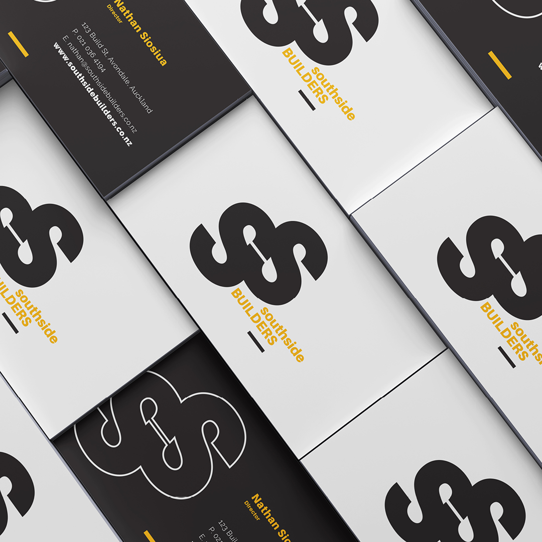
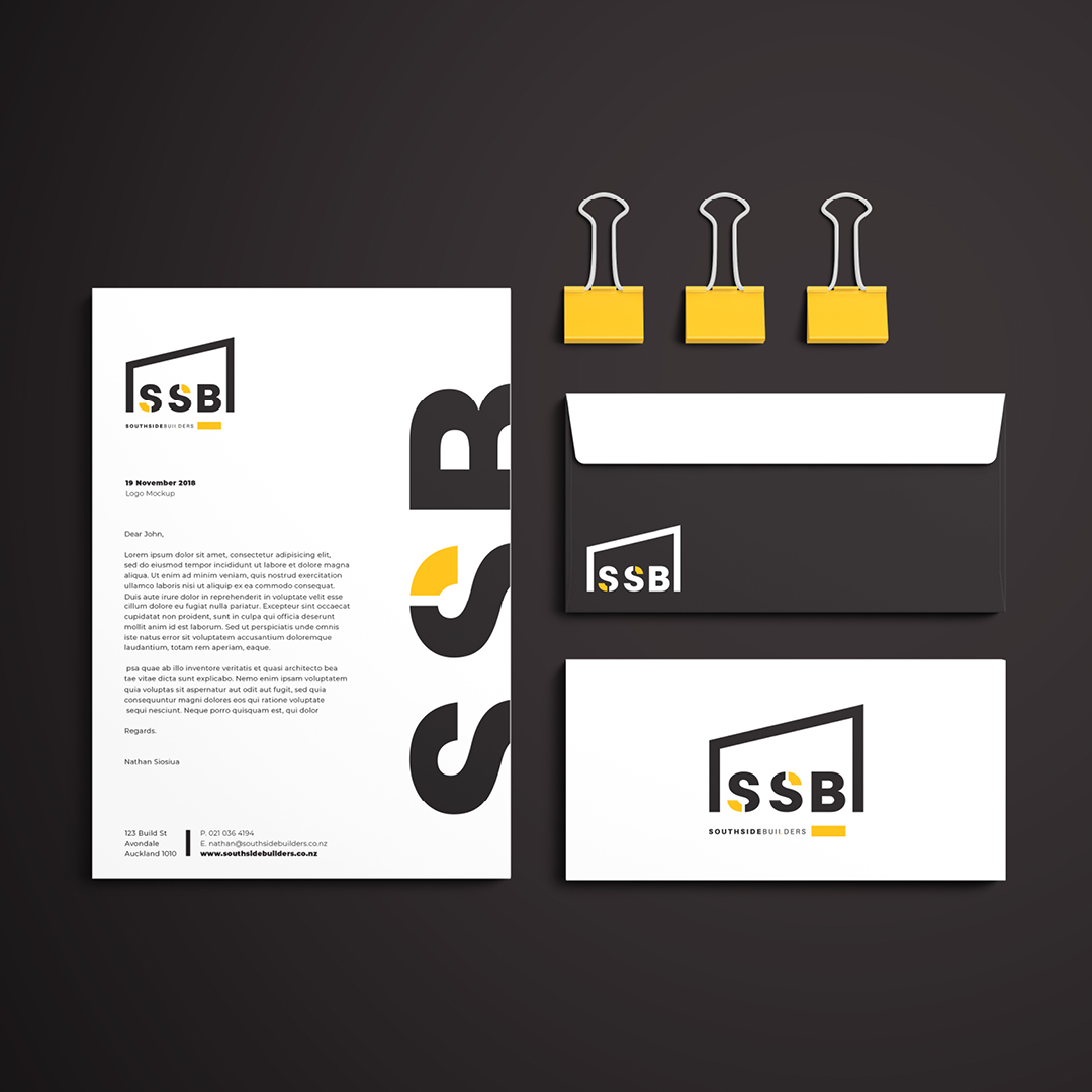
Several other concepts were created in the process and are shown here also.
Task
Logo Design & Visual Identity
-
Skills
Adobe Illustrator
-
Client
Southside Builders
-
Branding:
Logo creation & Visual Identity
-
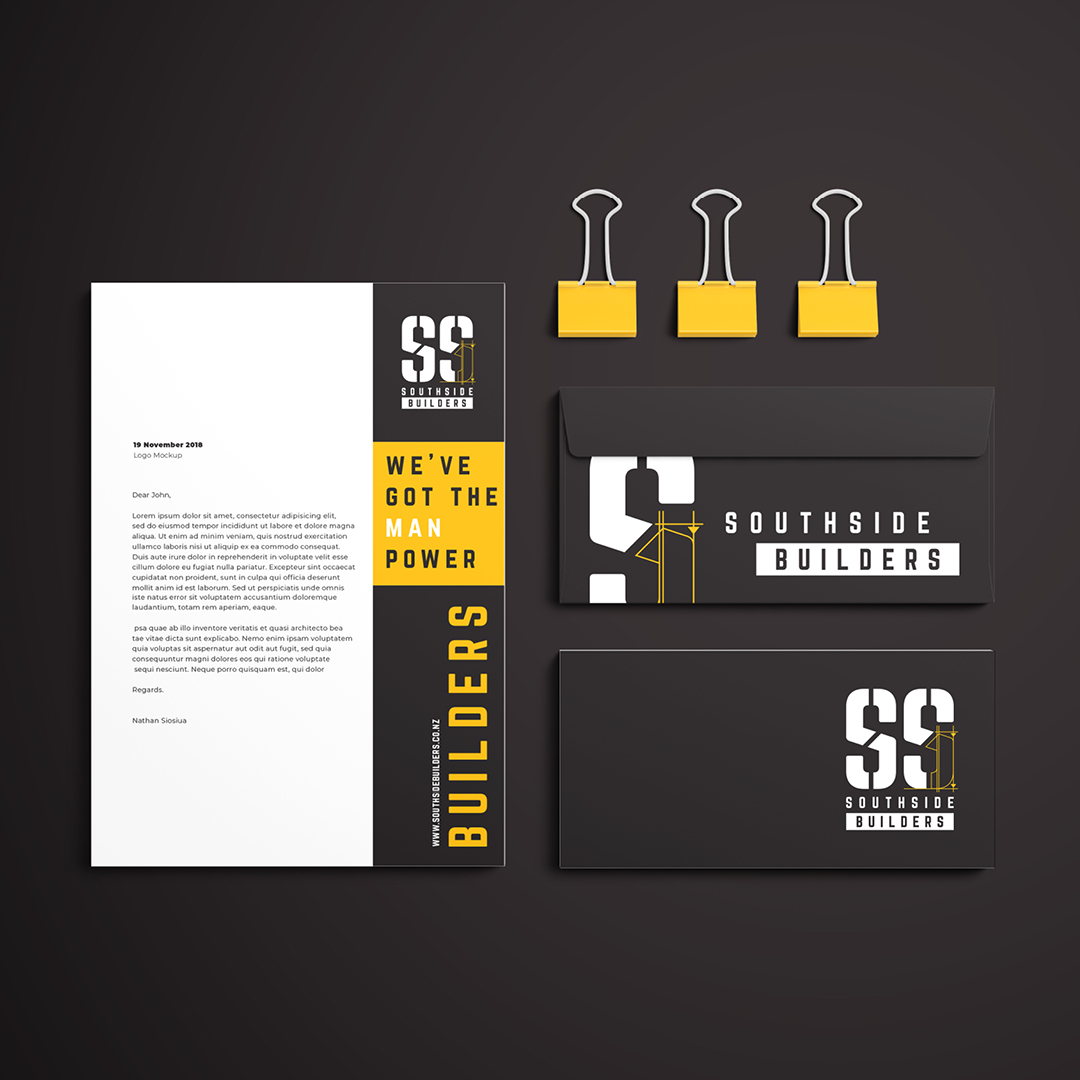
Branding:
Corporate Stationary
-
Branding:
Vehicle Signage