Bays Chiropractic Visual Identity – Rebrand
Bays Chiropractic Visual Identity – Rebrand
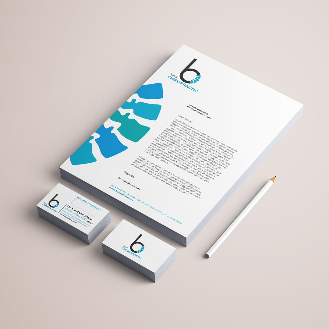
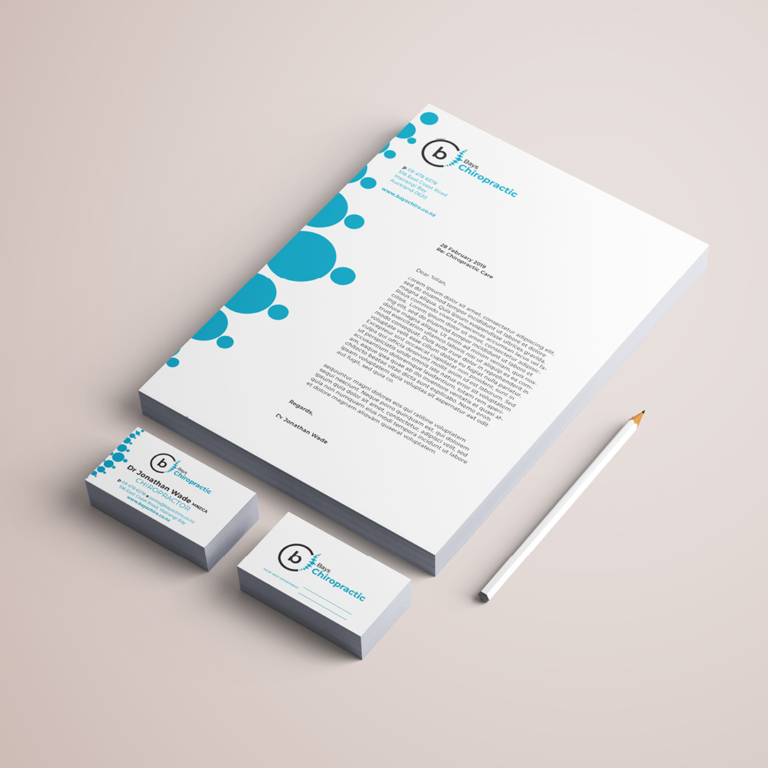
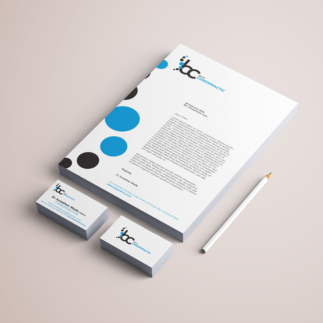
This client's current brand had not been touched for many years and was in need of a rebrand. The brief was to use the words 'Bays Chiropractic' in full, with emphasis on the word ‘Chiropractic’. The logo had to incorporate a monogram comprising of the letters ‘B’ and ‘C’ (without appearing too B.C./Before Christ). This icon had to also incorporate a spine image or symbol in some form. This icon needed to be able to be used on it’s own and to form supplementary Bays logos for their other services.
The Design was to be modern, clean and professional, appealing to a wide target market, while the colour palette stemmed from the existing colour theme of blue and green, but required more modern hues.
Several concepts were created during the concept process and are featured here also.
Task
Logo Design & Visual Identity
-
Skills
Adobe Illustrator
-
Client
Bays Chiropractic
-
Branding:
Logo Design & Visual Identity
-
Branding:
Corporate Stationary
-
Branding:
Uniforms